
In this guide
Paint color is the cheapest major design decision in a room and the most frequently regretted. A color that looked perfect on a chip reads completely differently across 400 square feet of wall under the room’s actual light. The problem isn’t the color—it’s that colors don’t exist independently of the light that hits them, the room’s fixed elements, and the colors adjacent to them.
This guide covers how light direction affects every color decision, how undertones work and why they matter, how to approach each room differently, and the sequence that produces fewer regrets than buying a gallon and hoping.
Light Changes Everything
The same paint chip looks different in every room—sometimes dramatically different. Light reflectance value (LRV) measures how much light a color reflects on a scale of 0 (pure black) to 100 (pure white)—Benjamin Moore’s color education resource. A color with an LRV of 60 bounces back 60% of the light that hits it. In a bright south-facing room, that reads as a near-white. In a dark north-facing room, it reads as a mid-tone gray. Same paint, very different result.
Natural light changes color throughout the day. Artificial light shifts it further—incandescent bulbs warm everything toward amber; LED bulbs with a high Kelvin number (4000K+) cool things toward blue-white. Test paint samples on the actual wall under both conditions before committing.
Light Direction by Room
| Room | Light direction | What it does to color | Adjustment |
| North-facing | Cool, flat, consistent | Blues go gray; greens go dull; reds look darker | Warm the color or increase saturation |
| South-facing | Warm, bright, changes through day | Shows colors most accurately; yellows intensify | Test at multiple times of day |
| East-facing | Warm morning, flat afternoon | Warm tones glow in morning; look flat by evening | Choose based on when room is used most |
| West-facing | Flat morning, warm evening | Cool colors look washed out midday; warm up at dusk | Choose based on when room is used most |
Undertones: The Hidden Variable
Every paint color carries an undertone—a secondary hue that surfaces under certain light conditions and against adjacent colors. A white that looks clean on the chip reveals a pink undertone against cool gray trim. A beige that reads as warm in the store looks greenish against warm wood floors. Sherwin-Williams describes undertones as the underlying pigment bias that becomes visible when the color interacts with light and surrounding surfaces.
There are 3 common undertone families. Warm (red, yellow, orange), cool (blue, green, purple), and neutral. Identifying a color’s undertone requires looking at it against a true white and a true neutral gray. The undertone appears in the comparison. A white paint that looks slightly pink next to a neutral gray has a red undertone. It will amplify any warm tones in the room’s fixed elements (wood, brick, tile) and clash with cool ones.
The fix for undertone surprises isn’t choosing a different color—it’s choosing the right undertone deliberately. A room with warm wood floors, brass hardware, and warm-toned textiles wants a paint with a warm or neutral undertone. A room with cool gray stone, chrome, and linen benefits from a paint with a cool or neutral undertone.
Room-by-Room Color Logic
Living Rooms
Living rooms work best when the color serves both daytime and evening use. Architectural Digest recommends testing colors at three different times of day before making a final decision. A color that looks sophisticated under natural light can feel oppressive under warm artificial light in the same room.
For living rooms with mixed light, medium-value neutrals perform reliably across conditions. They don’t commit to a specific mood that can feel wrong under different lighting. Deeper, more saturated colors work well in living rooms when the goal is a strong atmosphere, but they require adequate natural light to avoid looking dark and heavy in the daytime.
Bedrooms
Bedrooms are the one room where a deeply saturated color often works better than people expect. The room is primarily used at night under artificial light. The conditions that make darker, richer tones look their best. A deep navy or forest green that might feel heavy in a daylit living room can read as enveloping and deliberate in a bedroom lit by lamps.
Cool colors have documented associations with lower perceived stress in interior environments. Research in the journal Color Research & Application found cool hues consistently rated as more calming than warm hues across study participants. For a room used for rest, that association is worth factoring in alongside personal preference.
Kitchens
Kitchens benefit from colors that respond well to the activity and light conditions present—usually bright overhead lighting plus whatever natural light the window provides. Light colors work well in kitchens—they reflect accurately and don’t compete with countertops, dishes, or ingredients.
The pitfall with white kitchens: undertones become more visible in a large expanse of bright paint under direct lighting. A white with a strong yellow undertone looks fine in a swatch but reads as cream or ivory on four walls under kitchen lighting. Pull white chips against each other in the actual kitchen to identify which reads as true white in that specific light.
Bathrooms
Small bathrooms benefit from light-value colors with high LRV (above 60). The goal is to reflect light around the space rather than absorb it. Colors that read as fresh and clean in bathrooms lean cool—blue-whites, soft seafoam, pale gray—rather than warm. Warm tones can make a bathroom feel intimate but also smaller and dimmer.
For bathrooms without windows, a cool, high-LRV paint combined with warm-temperature lighting creates the most appealing contrast. Cool paint reflects the warm light and prevents the space from feeling orange-yellow under incandescent or warm-LED bulbs.
Home Offices
Color in a workspace affects perceived productivity. Blue and green are associated with focus and reduced eye fatigue during extended screen time. Benjamin Moore’s color psychology resource points to mid-toned blues and greens as the most common workspace colors—enough presence to hold on camera, not so dark they absorb natural light.
An accent wall behind the desk adds visual interest without committing the whole room to a color that feels heavy during long work sessions.
Dining Rooms
Dining rooms are usually the place for the most adventurous color in a home. The room is used in short sessions, primarily in the evening under warm artificial light, and a strong color reads as intentional rather than overwhelming in that context.
Deep, saturated tones photograph well and create the sense of enclosure that formal dining benefits from. In small dining rooms, a deep color on all four walls can actually feel larger than a pale color—the room becomes its own environment rather than something that needs to be stretched visually.
How to Test Before Committing
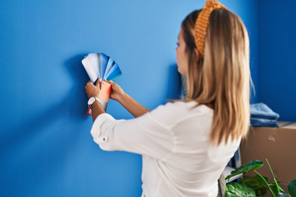
Sample pots are the only reliable test. Paint a 12×12-inch square on the actual wall—not on a piece of paper or card taped to the wall. Look at the sample at different times of day and with different light sources on. View it from different distances and angles in the room.
Sample boards—painting the sample on a large piece of card or foam board—allow direct comparison between two or three colors by holding them side by side on the wall. Benjamin Moore and Sherwin-Williams both offer 2-oz sample pots for under $5. Two or three samples tested on the actual wall cost under $15 and prevent the far more expensive mistake of buying a full gallon of the wrong color.
Coordinating Colors Across Rooms
Open-plan spaces and homes where multiple rooms are visible from a single vantage point need color coordination between spaces. The approach that works best is choosing one dominant neutral for the main living areas and using complementary accent colors in individual rooms to create variation without clash.
The undertone is the thread that ties colors together. A home where every room uses a paint with a warm undertone reads as cohesive regardless of the specific hues. A mix of warm- and cool-undertone colors in adjacent rooms creates visual friction even when the colors themselves aren’t particularly different in value or saturation.
The 60–30–10 rule from interior design—described in detail by Architectural Digest—allocates 60% of the room’s color to the dominant tone (usually walls), 30% to secondary elements (upholstery, large furniture), and 10% to accents (throw pillows, artwork, accessories). Paint color works within this framework, not independent of it. The wall color should respond to what’s already in the room, not the other way around.
Bottom Line
The chip in the store and the paint on the wall are different experiences. Test samples on the actual wall, at different times of day, before buying a full gallon. Identify the undertone before choosing—it’s what creates harmony or friction with the room’s fixed elements. Let light direction inform the color’s value and temperature. Start with the room’s fixed elements (flooring, trim, hardware) and choose the wall color to work with them, not around them.
Sources
Every external claim in this guide links to its origin. Collected automatically from the text above.
- Light reflectance value (LRV) — seatingmatters.com
- Sherwin-Williams describes undertones — sherwin-williams.com
- Architectural Digest recommends testing colors at three different times of day — architecturaldigest.com
- Research in the journal Color Research & Application — pmc.ncbi.nlm.nih.gov
- Benjamin Moore's color psychology resource — benjaminmoore.com
- described in detail by Architectural Digest — architecturaldigest.com

Nina Kowalski
Nina covers flooring, renovation planning, and DIY repair guides for Decor Modern. Her focus is translating contractor-level knowledge into step-by-step instructions that a homeowner can actually follow on a Saturday morning. Before writing about home improvement, Nina spent four years managing renovation projects for residential properties in the Midwest — coordinating work between flooring installers, painters, and general contractors. She worked on projects ranging from single-room updates to full-home renovations, gaining firsthand experience in budgeting, timelines, and contractor coordination. That experience taught her which shortcuts work, which ones backfire, and how much things really cost when the estimate meets reality. She saw how initial estimates change once work begins — and which decisions tend to increase costs or cause delays. Her most-read articles on Decor Modern include a guide to fixing scratches on hardwood floors and a breakdown of the cost to refinish hardwood floors. She also writes the site's cost comparison pieces, where she digs into real pricing data rather than repeating vague national averages. Her writing is grounded in real project constraints — including labor availability, material costs, and unexpected issues that arise during renovation. Nina holds a degree in Communications and has contributed home improvement content to several online publications. She lives in Ohio, where she is currently refinishing the original oak floors in a 1948 Cape Cod — one room at a time.